Usability Testing - Museum Admissions Purchase - MoPOP: Museum of Pop Culture
Design for Passion, MoPop: Mobile Website – Museum Ticket Usability Testing
CLIENT
Museum of Pop Culture (MoPOP) Seattle, Washington
PRODUCT
https://www.mopop.org/tickets
ROLE
UX Researcher
Teammates: Pranali Raorane, Luka Sherman, Harsheen Vohra, and Kaitlyn Zhang
Special thanks to Amy Chen, Neal Castelo and Clara Too
TIME
July 2022 – August 2022
Project Overview:
The Museum of Pop Culture sought a usability study on the mobile ticket purchase experience to inform a website redesign in 2023.
The goals of the usability test included establishing a baseline of user performance, establishing and validating user performance measures, and identifying potential design concerns to be addressed to improve efficiency, productivity, and end-user satisfaction.
Key Tasks:
View Exhibitions
Evaluate Plan Ahead Pricing
Purchase Tickets
PROJECT TIMELINE
Phase 1: Preliminary Proposal
Project outlinePhase 2: Usability Test Plan
Defined methods and proceduresPhase 3: Script Writing
Finalized specific tasks and phrasingPhase 4: Data Analysis
Log Data & Analyze FindingsMethods and Procedures
Recruitment
UW HCDE Slack
Local FB Groups
Compensation = MoPOP Admission Ticket
Interviews
Shared mobile device screen via Zoom
Asked participants to think-aloud
Post-task questionnaire
Analysis
Data Collection
Affinity Mapping
Identifying and prioritizing findings
Our primary area of research revolved around planning a visit and purchasing a ticket. We wanted to see if participants could find an exhibit and plan a trip on MoPop’s mobile site. We also wanted to examine participants’ understanding of the Plan Ahead Pricing, and what influences a ticket purchase. Lastly, we wanted to understand how participants purchase tickets.


Findings and Recommendations
5 of 6 participants were able to find the start date. One participant could not find the exhibition start date and rated the task difficult.
Participants were unsure whether exhibitions would be available for the date they purchased admission.
“I feel like an end date is kind of important. I can find the start date, but I don't know when it ends. I would probably want to know when the exhibit ends. I would have to dig deeper to find it.”
Recommendations:
Highlighting and separating the date could help users notice it faster.
Add an ending soon tag in front of relevant exhibits.

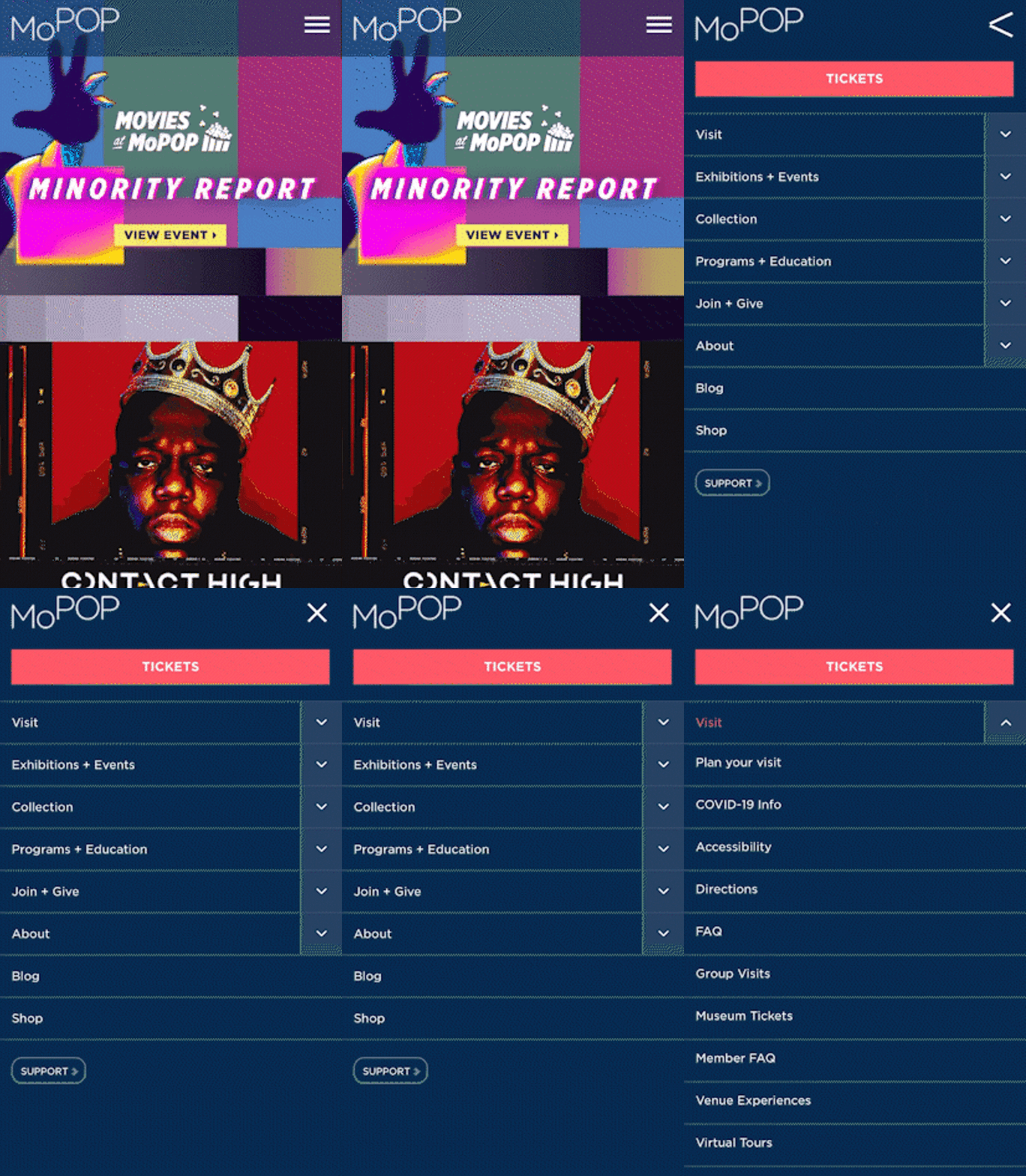
3 out of 6 searched in the menu first, generating more clicks per task.
“I feel like there’s a lot of information. The menu is very cluttered.”
“This menu is very nested. It’s hard to tell what's the hierarchy. It’s hard to tell at first glance how to find what I’m looking for.”
Recommendations:
Menu hierarchy could have a clearer division of categories and subcategories using indentation or colors.

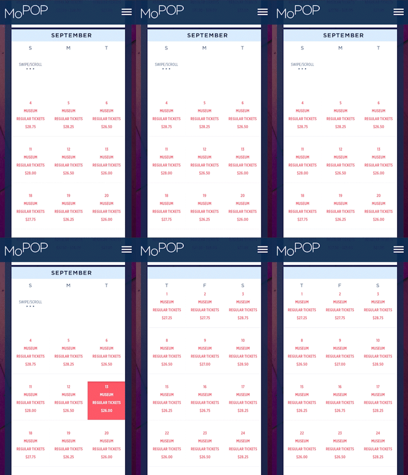
Users found horizontal scroll difficult to navigate.
“The calendar page isn't really optimized for mobile.”
Participants described comparing prices across dates on the calendar as difficult.
One participant noted would be helpful to have prices color-coded. One would like to see an overall view of prices, i.e.: blanket weekday discount vs. small variations.
“As someone who wants to save as much as I can, I would probably consider the Plan Ahead Pricing and select the cheaper ticket.”
Recommendations:
Changing the calendar view to see all dates clearly without a horizontal scroll will allow users to compare the prices quickly.
Next Steps:
Prototyping the design interventions and testing against the current design in a comparison study.
Aquiring analytics on drop-off/conversion rates with updated ticket purchasing experience.
Analytics on ToT (Time on Task).
Lessons:
The usability tests conducted on the MoPoP website were key to understanding how users’ motivations and values shaped their experience performing our test tasks.
Information in the form of insights from the test participants brought a few usability and design issues to light.
Based on the data collected, our team came up with plausible design interventions MoPop could prototype in their next website update.